-
Exciting Find in the Art World!
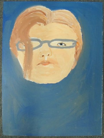
I’m still awaiting confirmation from the Picasso estate, but I’m fairly confident that I have in fact found a long lost and very rarely seen painting that many art historians see as an important and heretofore missing link between the famed artist’s Blue Period and his later, more abstract work.
I swear to you this is no Nigerian scam (I do all that under a different website) – but I am going to need one or possibly more investors to help me acquire the piece.
I was in that dingy thrift store across from CVS in Reseda the other day looking for a sturdy pair of hip-waders (best kept secret among those who butcher our own meat) and I happened to glance up – I don’t know why, I think something flew by my head, but thank God I did look up! – and there she was, way up on a shelf in the corner of the store next to some framed piece of crap poster of Mickey & Minnie Mouse in ugly 80s clothes. I nearly had a trauma when I realized what I was looking at.
My God, it’s breathtaking. Breathtaking. Notice how the nostrils seem to follow you from whatever angle you look at it on your computer. I don’t have to tell you – finding something like this in some filthy thrift store is what every boy dreams about!
…And me without the 99¢ they were asking for it! (I’d just come from the grocery store and had no cash on me – and it would have been obnoxious to use a credit card for something less than a buck.)
If I know my modern art history, this is very likely the legendary Portrait of Madame Pineau Wearing Hipster Glasses (1911), which Picasso reportedly sold to pay off a Monopoly debt (though some accounts have him trading it for a Milky Way Midnight to satisfy a late-afternoon dark chocolate craving).
So here’s where you come in: You go to the store, buy it, and then if it’s the masterpiece I believe it to be, we split the profits. And if it’s worthless, hell, you’re only out a dollar. You can paint over it and use it as a sign for your yard sale next weekend. And if you’re getting rid of your hip-waders, let me know.
-
A Rubber Stamp!
Recently, a pal and I were in a local closeout store. Folks from way back remember the chain as Pic N Save, but they’ve since changed their name to Big Lots. Well, said pal loves her rubber stamps – Christ Almighty, she’d get a tattoo of a rubber stamp if they could just put it on with a rubber stamp, instead of the painful, time-consuming, and all-too-often deadly process of getting pricked by a disease-laden (or -ridden?) needle by some so-called tattoo “artist.”
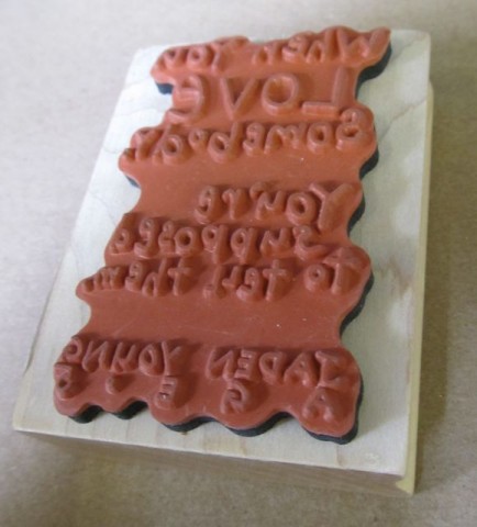
Anyway, I was pressing all the buttons on a shelf full of cheap talking toy trucks when I hear over the din, “Ted, come here – I’ve something to show you.” And by God, she sure did – she’d found a rubber stamp for sale at Big Lots:
Oh, Christ, that’s probably all confusing to you.
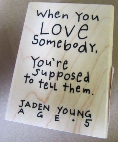
Here, let me show you the front of the stamp; that is, the block of wood on which it’s mounted.“When you love somebody, you’re supposed to tell them.” Hm.
Okay, here’s my problem with this:First of all, this is supposed to be some brilliant out-of-the-mouths-of-babes revelation? Seriously? This is what passes for heartwarming sentiment these days?
Secondly, even if you like the inane statement up there, there’s no artwork to the stamp; it’s merely text. You could save your money and copy it down on a scrap of paper and then when you wanted to include it somewhere, just rewrite it yourself. What’s preventing me or you or anyone from doing that? I’ll tell you what: Not a goddamn thing.
And finally, who on earth is Jaden Young? Is he supposed to be known for these pithy little nuggets of wisdom? Because if he is, I’ve never heard of him, and I know you haven’t. Who the hell does Jaden think he is, Mattie Stepanowicz? (Also, I hate the name “Jaden.” It’s right up there with “Caitlyn,” folks.)
So even if you like his cloying little saying, do you really want to stamp the name and age of some complete stranger along with the rest of his message on the back of the envelope when you send in your check to the gas company? Ha, no wonder these things ended up at Big Lots, right?
Remember when Jerry Van Dyke was doing those ads for Big Lots a few years ago? I kept hoping they’d make one where he was doing his yo-yo tricks. How hard would it have been to work that into one of them?
-
A Bowl of Ice Cream!
As you know, traditionally, on Fridays, I like to leave you with a little something to think about over the weekend – a thought or question to reflect on, that perhaps you’ll maybe come away with a little better understanding of our place in the world.
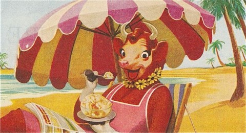
To that end I offer you an old Borden’s ad I found in a magazine. You know how I like old magazines, and any time I can pull a wad of them out of the trash heap that is Nana Parsnips’ house, I do so. It’s that much less crap I’ll have to throw away when she finally passes. (God forbid.)
As you can see, we’ve got a pretty, almost picture-postcard image of good ol’ Elsie the Cow.
She’s enjoying a bowl of delicious ice cream. And here’s where things get weird.
Ice cream, it turns out, is made from milk.
Cows give milk.
It’s therefore quite possible, née, probable that the very bowl of ice cream Elsie is enjoying was made from milk she produced herself.
How different is that than you or I sitting on the beach, clipping our toenails, tossing them in a bag of cheap trail mix and then presuming as we snack on a handful that the clippings are shards of particularly tough almonds or thick, sharp slivers of dessicated coconut?
Now – same question, but picture the above scenario at a stretch of shoreline adjacent to a clothing-optional beach, and there’s really no line of demarcation telling me I had wandered into in an area where I needed to put my Umbros back on. I think a $135 ticket is a little outrageous.
-
Anachronistic Food Packaging – An Important Update!
Last week, as you’ll recall, you attended Part II of my lecture series, “Understanding and Appreciating Anachronistic Package Design That I Found at the 99¢ Only Store” or whatever the hell I called it. Here, here’s a link in case you somehow forgot, and if you forgot, for God’s sake don’t tell me, because it’s just going to make me upset.
Anyway, Number 10 in that slideshow was an unassuming little roll of candy called Necco Wafers, sure.
Well! Wouldn’t you know it – as soon as the package design people at the New England Confectionery Company got wind of my article, they were so embarrassed that they immediately updated the packaging, and somehow got the new Necco Wafer rolls in the stores the very next day, all because of my article shaming them, which was not my intention – you know this!
I was celebrating the “old school” (as you call insist on calling it) look of all of these products, Necco Wafers among them. Celebrating, not denigrating! I need to put that on a t-shirt. Look for it as soon as I get my Café Press store up and running. (Soon – promise!)
So let’s take one last look at the Classic Necco Wafer packaging before it’s gone forever, and brother, let me tell you – if you come across any of these old packages, snatch them up! They’re not making any more of these wrappers! Forget buying gold – put your money in vintage Necco Wafer Rolls – if you can even find them!
Below: The End of an Era – Classic Necco Wafer packaging, 1847-2011.*
*1847 date an estimate only, based on year company was founded. Not a guarantee.

Below: The Necco Wafer of Tomorrow and Beyond – The New England Confectionery Company’s reboot of the popular “Necco Wafer” franchise.

You can’t stop progress, I guess. I’m just relieved that as a concession to us anachronistic package designophiles – you included! – that the typeface they used for the words “The Original” looks kind of classic – you know, like something you’d see on the menu of a 50s themed diner, right?
Obviously, I anticipate this mention on my blog will send demand for the chalky, delicious candy discs through the roof. I also anticipate that the Necco people will thank me by sending me a case or two of candy (but not Necco Wafers, please – something with actual chocolate in it, for crying out loud.)
-
A Sneak Preview!
My next show is in August at a small gallery in West Los Angeles. Nothing’s concrete yet, so I don’t want to mention the name of the place until “Zasu” (How pretentious is that for someone in her early 40s who moved out here twenty years ago from Chicago and never made it as an actress? Newsflash, her real name is Susan.) who owns the place pays me for two pieces which were DESTROYED at my last show there.
Some jackass decided to smear the chocolate frosting from a cupcake on both dogs’ asses (which I did in chalk pastel and I cannot get it off without smearing it or ripping the paper) on my mixed-media drawing “Freckles and Wilhelmina” from the Springer Spaniel series. (And did I mention the white “jimmy” strategically placed on Freckles presumably to represent a worm sticking out? Disgusting.)
And some other loser thought it would be “funny” to take chewing gum and permanently adhere two Connect Four checkers (one red, one black) to my grandmother’s glasses on my cibachrome photogram print “Nana Remembers.” It’s completely beside the point that “Nana” sold after it had been defaced – the fact is that was not how I created it and I have therefore disowned it.
To add insult to injury, Zasu wants me to replace the Connect Four game (not just the two missing checkers!) for her “game shelf” which is ridiculous, because I happen to know she bought the game at a yard sale – because I was with her at the time. (Those days are over.) I either want sixty dollars cash for the two pieces ($40 for “Freckles and Wilhelmina,” $20, punitive damages, for “Nana Remembers.”) or seventy-five dollars in food credit, no exclusions – redeemable any time, after the NuArt lets out, Sunday brunch, to go, whenever! If I decide I want to buy out all their pumpkin shortbread muffins right before the Saturday morning rush, I want to be able to leave with all twelve.
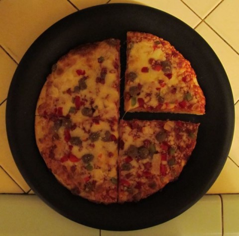
Anyway, I thought you’d maybe like to see a “sneak preview” from my upcoming gallery show (official announcement after she pulls her head out of her ass). The show is going to be called “Time to Eat” (unless I come up with something better) and I got the idea when I made a pizza the other night and it looked like a clock that reads three o’clock. Ah, but three a.m. or three p.m.?
That, like all art, is open to interpretation.
Above: Three O’Clock – Digital Photography (but will be available on Premium Glossy Photo Paper), 2011
The pizza, by the way, was on sale at Target for $1 each. It’s a Tony’s Crispy Crust Party Time Supreme Pizza. Jesus, I wish I bought like ten of them – they’re really good (but the sale is over now).
-
5 Things I Found In That Filipino Market That You Think Sound Dirty!
LAST WEEK I introduced you to the wonders of the local Filipino supermarket, remember?
It was a big move for both of us – you know, stepping outside of our comfort zones and buying food – to eat! – at a store where there are fish heads on ice for sale and in the dairy case there’s like six different types of bird eggs available, and that’s not counting the usual kind (from, what, chickens, right?). But this place hasn’t been closed down by the Board of Health, so I guess they’re doing something right. Or someone’s being paid off. Who knows?
Anyway, it struck me that a lot of the stuff they sell – and by a lot, I mean five things – have dirty-sounding names. At least you think so, you perv! Oh, that’s real mature, pal. Reeeal mature. What are you, in grade school?! And here they are:
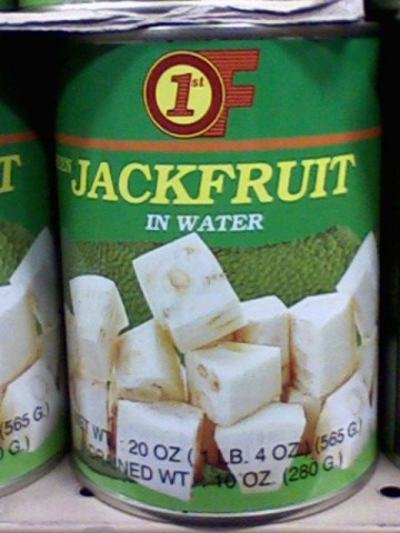
Ha! Jackfruit! I mean, what were they thinking when they decided to call it that?! Ha! Jackfruit! Haaa! Ha!
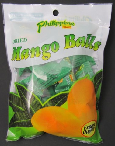
Oh my God! These things are called Mango Balls! Wait, wait – Dried Mango Balls! Can you believe it! Someone signed off on this! “Hey, we need a name for our new product. What should we call it?” “How about Mango Balls?” “Sure, sounds good!” Did they not think this thing through? I guess not!
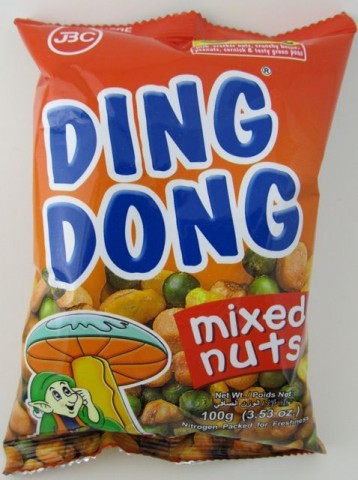
Ding Dong! Ha! And – ha haaa! – it says Mixed Nuts on the front! Also an elf sits under a mushroom, and I don’t have to tell you what that reminds everyone of! (Why, a leprechaun, of course!)
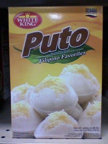
Puto! Now some of you might say “Well, Puto doesn’t sound dirty!” It does when you live in a part of the country with a proud Latino cultural heritage, sure! The fellas in the weight room at my gym are always calling me “puto,” no doubt ribbing me good-naturedly for my tendency to forget to wear underpants under my basketball shorts (leaving precious little to the imagination, especially when I’m doing my jumping jacks). So whatever “Puto” means in Filipinese, it apparently means “pony-sized genitalia” in Mexicanian – making this particularly funny now that I’ve deciphered it for you! Ha! “Puto!” If the people at White King Foods only knew! …”White King”?! – that’s racist!
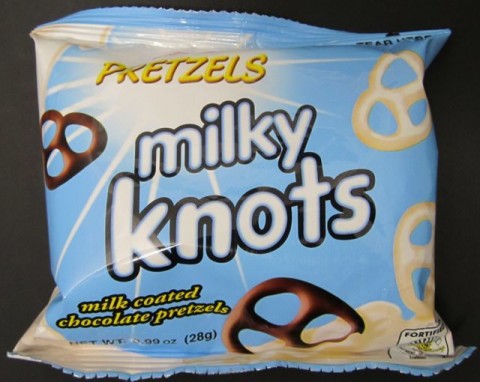
Finally, here we have Milky Knots. Ha! Ha ha ha, “Milky Knots!”
Actually, this one sounds dirty and also painful somehow.Look, we all had a good laugh here, but for God’s sake man, how old are you? Grow up!
Heh heh…”Mango Balls.”
-
Twelve Germ-Free Inches!
I needed a new ruler and there I was at, yes, the 99¢ Only store yet again.
And this thing is staring me in the face:
Hey for 99¢ only, the price was right! So I bought it.
I have placed a Toolie Bird by it for scale.Now can we get a closeup of the label?
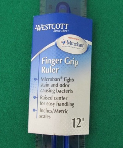
Aside from what you’re thinking – which is that Westcott sounds like the name of a chain of expensive hotels rather than a purveyor of fine measuring devices (Don’t worry, I thought the same thing.) – aside from that, what you’ve noticed is that they’ve manufactured a ruler protected with something called “Microban” which it seems “fights stain and odor causing bacteria.”
Hm.
Now, has this been an issue among those who use rulers perhaps more frequently than I do? Is this something that I just hadn’t heard about or experienced? Because I’ll be honest with you, I haven’t had this problem.
…What the hell are you people measuring?
-
10 More Foods I Bought at the 99¢ Only Store With Delightfully Anachronistic Package Design That I Need You To Be Aware Of
That’s right! Current products, all bought at my local 99¢ Only store – but each look like they’re from the past! It’s delightful! By God, I’m going to teach all of you to recognize anachronistic package design as well as appreciate it. Someday you’ll thank me for it.
By the way, if you missed the first installment, here it is. For you regulars – both of you – let’s get started! Let’s get started with some corn! (How many times have we all said that?)
This North Pride Cream Corn looks like it’s from…the early 1970s.
Proof of Its Modernity: Website address on back of label.
Where You’d Expect to See It: In a dump basket of off-brand, five-for-a-dollar canned items in a Hispanic grocery store off the 5 freeway on the way to Palm Springs.
Buy It Because: Makes a great side dish!
• With a whopping 5-1/4” x 2-1/2” of its label devoted to a photo of its contents, you know North Pride is serious about creamed corn. I’d like to think that the photo is a cropped image of an enormous vat of creamed corn, snapped by a factory employee who has propped a ladder against it and leaned way over the edge; now you’d like to think this, too. The North Pride people made a wise decision in making much of the label (that which isn’t dedicated to the mural of creamed corn) a bright, healthy, vegetable-y green. But I’m curious, and delighted, as now are you, as to why they decided to go with a sort of pale flesh tone for the rest of it. -
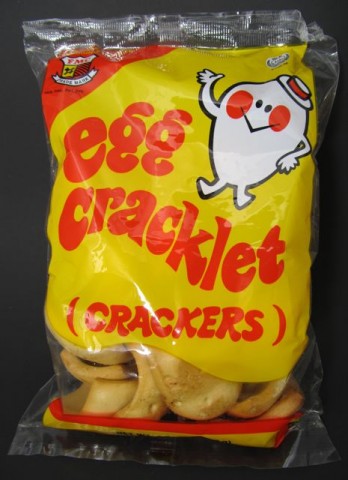
Egg Cracklet! (Crackers!)
IT was my houseboy, Kenji, who introduced me to the wonders of the Filipino market up the street.
Oh, what fun to watch him – in his undersized tank top embroidered with cupcakes that he’d begged me to buy for him at Justice for Girls (How could I deny him?) and the sarong I’d fashioned from a vintage Care Bear bedsheet (eBay!) – as he’d prance merrily down the aisles, loading my shopping cart with the exotic foods he remembered from growing up on his island home (ammonia duck eggs, purple yam biscuits, and his very favorite, Flamin’ Hot Cheetos curd).
I couldn’t help but laugh seeing him scamper to and fro, hiding and capering among displays of fish sauce and durian (often playfully holding up a pair of the oversized prickly fruit in front of his loins), and of course chattering gaily with the other men’s houseboys, always excitedly sharing snippets of gossip – trivial and ridiculous to you and me, but of the utmost import to Kenji and his kaibigans, their word for “friends.”
“Where is Nimuel this week?”
“I hear he cut his finger making lumpia, a type of fried spring roll popular among our people.”
“I have tickets to Katy Perry for next month!”
“OMG! You do not!”
“One dollar nineteen per pound for Seabass Goo? I am glad I do not pay the food-bills!”
“Ja ja ja!”Tuesday was the day when our coterie of stoic, stout men of means – all in our crisp white linen suits and stiff Panama hats – converged on the marketplace with our happy-go-lucky charges, snatching up raw milkfish and cooked canned pork, cinderblock-sized bricks of glass noodles and florescent pink hot dogs, fish sauce by the gallon, salted cassava rind and bag after bag of prawn-flavored crackers – a sort of cracker delicacy flavored with prawn, similar to our Andy Capp Hot Fries, but not as spicy and with a distinct prawn-like flavor – for the houseboys to prepare the week’s meals.
Okay, so I go down the snack and mung bean cake aisle and I see these things:
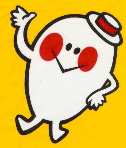
And it strikes me that the thing in the corner looks like one of those stupid Mr. Men characters or something from one of those stylized animated shorts from the early years of “Sesame Street” that they don’t show any more.
I mean, look at it:
Can’t you just see this thing explaining the concept of cooperation or teaching the letter Y?
What kills me is they get rid of quality stuff like this and the last twenty minutes of the show is freaking “Elmo’s World.”
Jesus Christ, no wonder our kids are in trouble.
-
Original “It’s A Mad, Mad, Mad, Mad World” Concept Art Discovered!
WELL, here’s something that’s sure to be of interest to you, because why else are you reading this?
Everyone’s favorite 161, 210, 192, 154, and/or 182 minute comedy from 1963, “It’s A Mad, Mad, Mad, Mad World” was originally called something else entirely! And also had different movie poster art! Or concept art or something. Sure, why not?
And, of course, we’re all familiar with Jack Davis’ iconic movie poster art from the film. Can we get a shot of that, please? The poster from the film…? Hello…! The poster from the film, please…?
Okay, obviously I’m going to have to go and snag it off someone else’s website. Excuse me a moment.
…And I’m back. Here we go:
There it is; we all remember that, right? Ol’ Jack managed to cram everyone from the film – well, save for Jackie Gleason, Lucille Ball, Abbott and Costello and the Ritz Brothers – into that mob shot there. Unfortunately, because of this oversight – not his fault, either – apparently when he got the assignment, the fax cut off on the third page of the list of the cast, so he didn’t even know they were supposed to be included – because of this mishap, let’s call it, it changed the film entirely.
At the time, movie poster paper was more expensive than film stock (remember, this was 1963!) and it was deemed too costly to redraw the poster with the missing cast (Adobe Photoshop still three years away!), so it was decided to simply cut Lucy, Jackie, Bud, Lou, and whatever the first names of the Ritz Brothers are – I’m not bothering with Wikipedia, it’s quarter to two in the morning – it was decided to cut their scenes from the film. And burn the negatives, so no record of them ever having been in the film exists. Also, swear the rest of the cast to secrecy under penalty of being forced to play a telephone repairman in an increasingly lousy 1970s sitcom starring a woman about whom my grandmother used to complain “Who the hell told Linda Lavin she could sing?”
But someone talked, thank you, Marvin, and I have it under good authority that their scenes comprised the funniest additional two hours, fifty-six minutes in the entire film that you’ll never have to sit through at some artsy movie theater in Santa Monica with an audience comprised of a bunch of people on the very fringes of the entertainment industry who all seem to know each other. …Wait, wait…where the hell was I going with this?
Oh, yeah, the original concept art. Or movie poster or something. Anyway, so recently, I was going through the personal papers Frank Capra left to the Los Angeles Valley College’s film archives (essentially one slightly crushed banker’s box) for some vague project I told them I’m working on, and managed to sneak out a bunch of stuff to list on eBay (Shhh! But be sure to bid!).
Anyway, this was stuck to the back of a beefcake shot of Frank “Dr. Research” Baxter from the Bell Laboratory Science Series film “Our Mr. Sun.” I’m guessing it was misfiled, since it was Stanley Kramer who directed “It’s A Mad, Mad, Mad, Mad World,” though Capra also has that funny “K” sound at the beginning of his last name so that’s probably how it happened.
Okay, okay, I’m getting to the artwork! Keep your shirt on! Jesus!
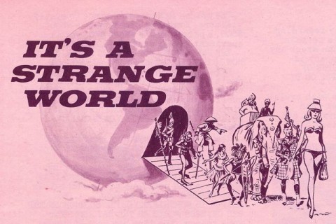
Here it is:
As you can see, originally, the film was originally going to be titled the decidedly more sedate “It’s a Strange World” and feature a much smaller – if not disparate – cast, if you don’t count the elephant. Wait, wait, can a “cast,” singular, be “disparate”? Okay, let’s say a disparate cast of characters. Does that work?
Regardless, judging by the artwork (Not Jack Davis, surprisingly; eagle-eyed MAD fans will recognize it as Don Martin’s work), it would have been quite a different film indeed. The Chinaman on stilts, though…? That’s something I think we can all agree that the final version would have benefited from.
Questions for Discussion:
1) How many people have I pissed off with this one?
2) Who might have been a better obscure comedy team to have included rather than the Ritz Brothers?
3) Oh, now who have I offended by implying the Ritz Brothers are “obscure”? Okay, yeah, I remember you from that screening in Santa Monica. You made sure everyone around you heard you say each line before the characters on screen did. Lovely.
4) Can you find at least two people in the concept art/recently discovered movie poster who also appeared as extras on “Jonny Quest”? (No fair checking IMDb!)
5) Yes, I’m aware that Lou Costello was dead for four years by 1963. Get off my ass. Would it have been any funnier had I written “Bud Abbott & Stan Irwin”? Oh my God, you get that, don’t you?
Ted Parsnips
?>