-
Delightfully Anachronistic Package Design: Summer 2012 Edition!
IF THERE’S SOMETHING that we all can agree on in these troubled economic times, it’s that everyone enjoys delightfully anachronistic package design – and rightfully so.
And by “delightfully anachronistic package design,” I mean packages – usually of food, and often bought at a local dollar store – that have the look of something that was designed decades ago and never updated. I find this phenomenon absolutely delightful and now…? Now, friend, so do you. Like watermelon-flavored Visine, it’s a treat for the eyes. Oh ho ho, watermelon-flavored Visine! Where do I come up with this stuff?
So, uh, here’s a bunch of things I found that look old.
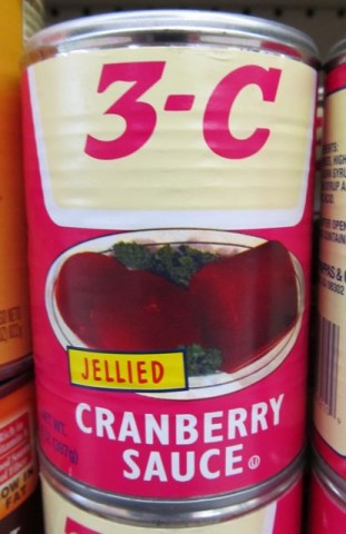
3-C Jellied Cranberry Sauce That Looks Like It’s From, Oh, Let’s Say the Mid-1960s
I found these in a wonderfully ratty dollar store in Carson, California months ago. But I’ve been saving the photo for a special occasion. Tonight’s the night, baby! Tonight’s the night!I didn’t buy them, I just took a picture (because it’ll last longer). What does the name “3-C” signify? Look, I just told you I didn’t buy it, so I have no goddamn idea! Let’s say it stands for priCe, Cwality, and, eh, Cranberries. I’m sure it’s a fine product.
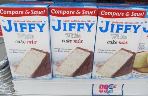
Jiffy White Cake Mix Looks Like It’s From the 1930s
Yes, I’ve covered Jiffy mixes in depth previously. All of their packages have a distinct anachronistic look to them. But this is the first time I saw the white cake mix before. White cake mix? That’s racist! And delicious!Libby’s Chunk and Sliced Pineapple Looks Like They’re From the Mid 1960s
Now here’s a tough one. I found these at my local Dollar Tree and the package design is very new – I forget what Libby’s canned fruits used to look like, but one thing’s for sure, brother, they didn’t look like this! These have a very 60s kind of style to them, but by Godfrey, if I find out this is an intentional attempt at a “retro” look, then they’ll be immediately disqualified and not allowed to compete. I’d like to think, and now you do, that this is just a label redesign that somehow looks old to me (and now you). Dare I include it here? As it turns out, I already have.Lady Linda Pound Cake Looks Like It’s From the 1970s
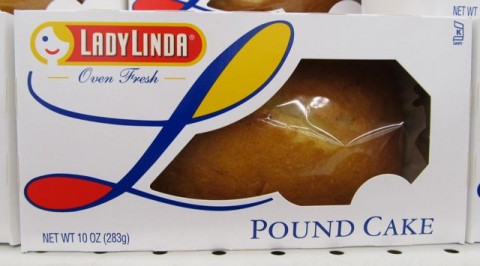
Ha! A so-called pound cake – that weighs ten ounces! (Settle down, settle down – I’ve already got my attorney on top of this.) Anyway, the lovely Lady Linda logo looks like something from about forty years ago, doesn’t it? …Kind of? Look, they can’t all have the striking visual anachronicity (a word I’ve apparently just coined and will soon trademark) of Jiffy cake mixes.Lava Heavy-Duty Hand Cleaner Looks Like It’s From the Late 1960s
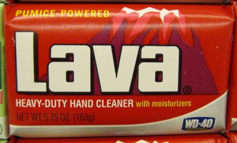
Aside from the addition of the WD-40 logo to the bottom and a few minor changes to the text (the omission of the exclamation point after “PUMICE-POWERED,” changing “THE HAND SOAP” to the current “HEAVY-DUTY HAND CLEANER with moisturizers,” among them) Lava’s wrapper is practically unchanged since 1960s, which is particularly amazing and wonderful. It’s such a great design it’d be a shame to change it. Lava soap has always been a small, specialty brand, and I bet if it had been owned by some huge Big Soap corporation, we’d be looking at swirly design things all over the package. Either that or photo-realistic globs of glowing, shimmering lava with highlights galore.Say, look – it still pretty much matches its corresponding 70s Wacky Package:
By the way, like you, I love Wacky Packages, used to collect Wacky Packages, and permanently stuck Wacky Packages to the closet door in my bedroom. And I still say, this is the worst parody name in the entire Wacky Packiverse. “Lova”…? What the hell…?! Clearly Art Spiegelmaus and Bob Shtewart just wanted to knock off early the day they came up with this one. “Lava Soap…Hmm…Tough one…Bava, Cava, Dava, Fava, Gava…” “Lova Soap! These are eight year olds we’re writing for. Good enough! Now let’s hit Buffalo Wild Wings for lunch!”
Showboat Pork & Beans in Tomato Sauce Looks Like It’s From 1923
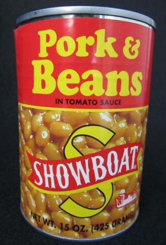
Here’s a secret the Bush’s Beans people – even the talking dog – don’t want you to know: They’re the company behind these value-priced Showboat Pork & Beans. Okay, maybe they don’t care if you know, since their name and website are listed on the back of the label. You’re probably asking aloud “Why does this jackass Ted think the can looks like it’s from 1923?” I’ll tell you why if you just shut up a minute: the typeface used for the words “Pork & Beans” is in fact the same used throughout a 1923 Sear & Roebuck catalog I found in Nana Parsnips catalog heap (in what used to be the shower). Add to that the “Showboat” name and logo, and, well sir, you’ve got a canna beans that looks like it’s 89 years old!Breakstone’s TempTee Whipped Cream Cheese Looks Like It’s From 1982
We don’t normally have Breakstone products out here in the filthy toilet that is Los Angeles, but oddly, they do turn up occasionally in – where else? – the 99¢ Only Store. And when they have TempTee whipped cream cheese, brother, I snatch it up by the palletful! So you can consider this entry a mini-What’s Bueno at the 99¢ Only Store post too – this stuff is just that good. Anyway, the pseudo-handwritten product name, the bright pink color and the little yellow stripes all scream the early 1980s. But be warned – the name and color seem to imply that this is some sort of light version of cream cheese – this, my calorie-counting pal, is not the case. It’s just whipped, but has the same amount of fat as regular cream cheese. This is why I limit myself to just one tub for dessert, during “Wheel.”Noh of Hawaii Vinha Dalhos Portuguese Fish Mix Looks Like It’s From the Late 1950s
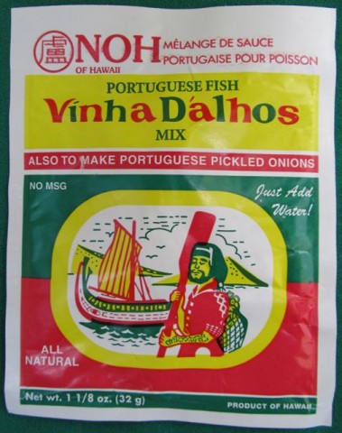
Just as you would, when I saw this at Big Lots for just 80¢, I had to try it. And not because I was at all curious about the taste, either – it’s that amazing three-color design that we found so nifty – to use the very vernacular of the era that I think it kind of looks like it’s from. Anyway, I had Ildefonsa fry me up some fish with it and it came out, well, okay.The thing is, your best, tastiest fish today are your overfished fish – your European seabass, your snapper, and my favorite, your orange roughy. A good rule of thumb is the more endangered the species and the higher the price, the tastier the fish. So I got Ilde up at five one morning last week, gave her twenty bucks to pick me up a couple of good, thick, New York-cut orange roughy filets from the Santa Monica Fish Market and even gave her an extra buck to help with fares on the six buses she’d need to take to get there.
Maybe it was the deliciously overpowering taste of the fish sauce and the fact that Ildefonsa oddly decided to cut them into eight uniformly rectangular slices before serving them to me, but they just didn’t taste like orange roughy. But she insisted, in her angry broken Germ-glish, that it was orange roughy. As much as I personally dislike the woman and constantly threaten her with deportation (more to scare little Kayla when she doesn’t behave), “Fat Frau Blucher” as I call her (she doesn’t get it!) has a good heart. She tells me it was Mr. Whisker’s birthday and that was why I found this box in the garbage…
…along with all the breading she patiently scraped off. (Damn cat’s apparently allergic to gluten now.)
Well, we all had some fun, but the booze is wearing off so I think we’re done here for now. Also, it’s just now occurred to me that we usually celebrates the pets’ birthdays along with the kids’, all on one day, December 25, every other year. Huh.
Ted Parsnips
?>